| Author |
 Topic Topic  |
|
67LEAFS
Top Prospect
17 Posts |
 Posted - 03/18/2007 : 19:51:35 Posted - 03/18/2007 : 19:51:35


|
|
For best I think it's a toss up between Chicago and Detroit...both are classics. Honourable mention goes to the Sharks. Worst is any the Canucks have had. Even their original logo...come on...a rink with a stick across it. Couldn't any come up with something at the time? Honourable mention goes to the Flyer's...too sixties.
|
|
|
Patchy
PickupHockey Pro

Canada
529 Posts |
Posted - 03/18/2007 : 19:54:22
|
Isn't there already one for this??
Anyways, best has to be chicago/leafs.
worst is the new sabres or the panthers.
~~Go Leafs Go~~ |
 |
|
|
PainTrain
PickupHockey Veteran

Canada
1393 Posts |
Posted - 03/18/2007 : 20:06:53
|
The Sabres old ones were the coolest the ones with the sword and the sabre.
Worst has to be oilers i don't like theres i do like there old ones tho.
And i'm pretty sure this question has already been asked. |
|
|
|
Saku Steen
PickupHockey Veteran
Canada
1102 Posts |
Posted - 03/19/2007 : 03:52:10
|
Its really old though. (the fourm)
I think Minnisota has the coolest because of all the detail. The colors are not the best but the logo is awesome.
Worst: Ducks and Sabers logos |
|
|
|
semin-rules
PickupHockey Veteran
Canada
1915 Posts |
Posted - 03/19/2007 : 05:22:55
|
Favourite: Colorado, Minnesota, Dallas
Least Favourite: Buffalo, Philly, Boston, Islanders
~~~~~GO STARS~~~~~ |
|
|
|
Guest9930
( )
|
Posted - 03/19/2007 : 08:30:59
|
Anybody remember the old "Captain Highliner" logo that the Isle had? That was pretty awful.
I think the best is the Phoenix Jets...I mean Coyotes new one with the howling coyotoe with the beige and terra cotta. I think that colour scheme and logo really works better for identifying with Phoenix and the desert. Hell of alot better than the "mosaic" garbage logo they had before. |
|
|
|
Buddyno2000
PickupHockey Pro

Canada
606 Posts |
Posted - 03/19/2007 : 09:17:44
|
Best
Oilers
Columbus
Buffalo ( the one with the sabres)
Colorado
Nashvile
Worst
Habs ( it looks like a toillet seat) I know it's vintage
Islanders
Philly
NJ (C'mon its the devils It would have been easy to do somthing cool)
Go leafs Go by the way |
|
|
|
Canucks Man
PickupHockey Veteran

Canada
1547 Posts |
Posted - 03/19/2007 : 10:45:42
|
Best: Canucks, Sharks, the Old Buffalo one
Worst: Oilers, New sabres
CANUCKS RULE!!! |
|
|
|
Guest4435
( )
|
Posted - 03/19/2007 : 11:07:32
|
My fav;s are penguins, minnesota and thrashers and u can throw in canadians (lots of history there)
least fav's are Boston, Chicago, oilers, rangers and islanders |
|
|
|
Mikhailova
PickupHockey All-Star

USA
2918 Posts |
Posted - 03/19/2007 : 13:03:32
|
Best: Minnesota, old Sabres (crossed swords)
Worst: Boston, new Sabres
The new New Jersey mascot = 
Hahaha |
Edited by - Mikhailova on 03/20/2007 16:42:11 |
|
|
|
oil fan97
Rookie

Canada
138 Posts |
Posted - 03/25/2007 : 11:08:27
|
Best Oilers old Buffalo
Worst Vancouver and new Buffalo
Oilers Rule!!! |
|
|
|
Saku Steen
PickupHockey Veteran
Canada
1102 Posts |
Posted - 03/25/2007 : 11:31:28
|
| Watching the BUF vs. TOR game last night and I noticed how cool the new socks look on the new Buffalo uniforms. |
|
|
|
1 Crosby fan
PickupHockey Veteran
Canada
1454 Posts |
Posted - 03/25/2007 : 12:00:44
|
Best:Canucks, Old Sabers, New Jersey, Minnesota, the canucks V jersey,
Worst:New Sabers, |
|
|
|
manninm
PickupHockey Pro

USA
347 Posts |
Posted - 03/27/2007 : 05:53:46
|
Kinda off topic, but the new Sabes unies are really nice looking.
Best - 'Nucks Alternate
Worst - Sabes Old (Black & Red - Flaming Goathead) or New (Speeding Slug) |
|
|
|
hithere311
Rookie

Canada
109 Posts |
Posted - 03/27/2007 : 08:08:24
|
Yeah, buffalo has by far the best JSERSEYS.
Best logos: Rangers 3rd (Statue of Liberty), Kings, Detroit
Worst logos:Florida, any ducks logo, Carolina, Calgary, Nashville 3rd, Pittsburgh
Classic but getting outdated: Philly, Montreal, Boston
Not Hockey: Columbus, San Jose |
|
|
|
leafsfan_101
PickupHockey Veteran

Canada
1530 Posts |
Posted - 03/27/2007 : 08:24:20
|
Did anyone hate the these Flames jerseys. They are so ugly.
[IMG]http://i157.photobucket.com/albums/t78/billy_pilgrim_01/hockey%20sweaters/hockeysweaters053.jpg[/IMG]
Long Live Leafs Nation!! |
|
|
|
hithere311
Rookie
Canada
109 Posts |
|
|
Saku Steen
PickupHockey Veteran
Canada
1102 Posts |
Posted - 03/27/2007 : 12:03:55
|
quote:
Originally posted by hithere311
Yeah, buffalo has by far the best JSERSEYS.
Best logos: Rangers 3rd (Statue of Liberty), Kings, Detroit
Worst logos:Florida, any ducks logo, Carolina, Calgary, Nashville 3rd, Pittsburgh
Classic but getting outdated: Philly, Montreal, Boston
Not Hockey: Columbus, San Jose
Blie Jackets logo has a bug on it holding a hockey stick, so its sorta hockey related. |
|
|
|
hithere311
Rookie
Canada
109 Posts |
Posted - 03/27/2007 : 13:41:00
|
| But take away the hockey stick and what is it?........................................... ............................. A bug. |
|
|
|
bablaboushka
PickupHockey Veteran

Canada
2417 Posts |
Posted - 03/27/2007 : 15:56:27
|
How is that (<---) logo not hockey related? Is there no stick in the Shark's mouth?
Take away the stick in the Blue Jackets' logo? Why? The whole point of the logo is for the stick to relate it to hockey. What do 90% of the logos have to do with hockey? Nothing. At least teams like SJ, Columbus, Atlanta and Pittsburgh incorporate their team name and hockey into their logo with a hockey stick. |
Edited by - bablaboushka on 03/27/2007 15:57:24 |
|
|
|
leafsfan_101
PickupHockey Veteran
Canada
1530 Posts |
Posted - 03/27/2007 : 16:14:58
|
I agree Babs, hockey does not need to be incorporated into a logo. Look at the Toronto Blue Jays in baseball. Or any of the bird teams(yes, Atlanta included). Cool logos that have nothing to do with their sport.
P.S. Did you notice that all of Atlanta's pro teams have birds except for the Braves (Hawks, Thrashers, Falcons).
Long Live Leafs Nation!! |
|
|
|
Guest7476
( )
|
Posted - 03/27/2007 : 16:27:11
|
| nashville predators all the way no competition god get a brain |
|
|
|
bablaboushka
PickupHockey Veteran
Canada
2417 Posts |
Posted - 03/27/2007 : 17:46:48
|
| C'mon guys enough with the personal attacks. |
|
|
|
Buddyno2000
PickupHockey Pro
Canada
606 Posts |
Posted - 04/02/2007 : 10:19:53
|
I know most people didn'T like this one but I loved it .
[img]http://www.onlinesports.com/images/jhd-nhl-islanders.jpg[/img]
Go leafs Go by the way |
|
|
|
Saku Steen
PickupHockey Veteran
Canada
1102 Posts |
Posted - 04/02/2007 : 12:11:44
|
| I dont really like the logo but the jersey colors look cool together. |
|
|
|
Guest4644
( )
|
Posted - 04/02/2007 : 12:45:53
|
| Nashville has the best logos. there are some pretty good ones in the AHL though. id say the worst would have to be Dallas. |
|
|
|
semin-rules
PickupHockey Veteran
Canada
1915 Posts |
Posted - 04/02/2007 : 14:33:30
|
quote:
Originally posted by Guest4644
Nashville has the best logos. there are some pretty good ones in the AHL though. id say the worst would have to be Dallas.
Sorry abuot the post before. I didn't mean it.
Colorado has the best and Boston has the worst

~~~~~COME ON STARS, LETS BRING IT HOME~~~~~ |
|
|
|
Guest6337
( )
|
Posted - 04/02/2007 : 16:02:50
|
| To any of you who ever said anything positive about the Buffalo hockey logo(s)....GIVE YOUR HEADS A SHAKE. The logo was obviously thought up by someone who took a few too many pucks to the noggin--Buffalo is a City in the North Eastern United States....there are no Buffaloes there, at least for several hundred years before the SABRES arrived there in the 1970s...it's not cool or sharp or anything else positive to send professional athletes out year after year into battle wearing logos on their chests THAT MAKE NO SENSE!!! The stylized Bs and sabres on their newer unis are a huge improvement. |
|
|
|
Leafs Rock Planet
PickupHockey Pro
Canada
902 Posts |
Posted - 04/03/2007 : 16:52:33
|
| If you think about it any kind of animal in any kind of sport is not related. |
|
|
|
Leafs Rock Planet
PickupHockey Pro
Canada
902 Posts |
Posted - 04/03/2007 : 16:55:43
|
| I think all the classic logos have to be the best.e.g-leafs,habs,bruins,hawks,rangers, and the wings which are all the original six. |
|
|
|
Mikhailova
PickupHockey All-Star
USA
2918 Posts |
Posted - 04/03/2007 : 17:12:28
|
quote:
Originally posted by Leafs Rock Planet
If you think about it any kind of animal in any kind of sport is not related.
Not quite true--the Florida Panthers are related to the area where the team's from. There is a rare species of panther that lives only in Florida, creatively name the Florida panther. That's where the team gets its name. |
|
|
|
manninm
PickupHockey Pro
USA
347 Posts |
Posted - 04/04/2007 : 06:22:54
|
Wow, Mik, that's a nice tidbit of info. Guess ya learn a new thing every day. As far as classic jerseys, those powder blue Pittsburgh unies from the 70's were great in my opinion. And Vancouver's from the early 80's (the V striped) were pretty hideous, but really funny at the same time!
And, guest 6337, agreed the logo stinks. I said the jersey itself is very sharp looking.
If you haven't seen these, celsius design did these back in 2002...I think they're great looking. http://www.newblueandgold.com/ |
|
|
|
Guest4722
( )
|
Posted - 04/04/2007 : 14:13:32
|
| I like the logos that everyone knows is hockey. Mostly the original 6 and some expansion teams like Philly. |
|
|
|
Guest6432
( )
|
Posted - 10/05/2007 : 04:56:14
|
best-Colorado yay avs!!!,detriot cuz the details
worst-habs booo habs,bruins
LONG LIVE AVS NATION!!! |
|
|
|
nashvillepreds
PickupHockey Veteran
Canada
1053 Posts |
Posted - 10/11/2007 : 16:39:43
|
Best :
Thrashers
Hawks
Predators
Worst:
Sabres
Bruins
GO PREDATORS GO |
|
|
|
Guest4944
( )
|
Posted - 10/16/2007 : 15:56:57
|
| sada best logo apana canucks |
|
|
|
KariyaSelanne
PickupHockey Pro
Canada
297 Posts |
Posted - 10/16/2007 : 16:54:35
|
quote:
Originally posted by Guest4644
Nashville has the best logos. there are some pretty good ones in the AHL though. id say the worst would have to be Dallas.
Hey guys, haven't been on in awhile, been busy with stuff.
Anyways, the Manitoba Moose's logo is pretty cool, it is one of my favorite logo's ever.
[img]http://content.answers.com/main/content/wp/en/thumb/5/58/125px-Manitoba_moose_200x200_2.png[/img] |
Edited by - KariyaSelanne on 10/17/2007 14:30:48 |
|
|
|
Mikhailova
PickupHockey All-Star
USA
2918 Posts |
Posted - 10/16/2007 : 18:53:48
|
Yeah I like the Manitoba Moose logo. It's pretty sweet.
[img]http://www.salmonkings.com/images/ManitobaMoose240.jpg[/img]
[img]http://www.ssur.org/experiments/ManitobaMooseContest/Images/ManitobaMoose_PL.jpg[/img]
____________________
Whether in hockey or politics, the Senators have always annoyed me |
Edited by - Mikhailova on 10/16/2007 18:54:25 |
|
|
|
fly4apuckguy
PickupHockey Pro
Canada
834 Posts |
Posted - 10/16/2007 : 19:05:37
|
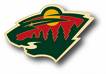
Worst - Ducks. They take three years to make the change (they were seriously talking about it that long) and that's what they come up with? The word "Ducks" with a wing as the D? That's god awful.
I agree with the assessment that the Wild have a great logo but bad colors.
My past favorites were the Rangers third jersey with the Statue of Liberty, and the Washington Capitals third with the Capital Building. I'm not even American, but I thought those were total class, and excellent designs. |
|
|
|
Guest4825
( )
|
Posted - 10/16/2007 : 22:56:46
|
best: Canuck's vintage hockey stick, philly (aggressive colours)
worst: COLUMBUS, im a canucks fan till I die but their new jerseys = disgusting |
|
|
|
Guest9648
( )
|
Posted - 11/12/2007 : 12:29:18
|
Does anyone remember the ugly purple and gold LA Kings uniforms from way back? I'm gonna go out on a limb here and say I actually liked them!
As for the ugly jerseys, I would have to go with the really old Senators jerseys that looked like something a prison inmate would wear. Brutal! |
|
|
|
Topic |
|