| Author |
 Topic Topic  |
|
|
just1n
PickupHockey Pro


282 Posts |
 Posted - 02/15/2011 : 12:23:17 Posted - 02/15/2011 : 12:23:17


|
Hey gang. The Lightning released an updated logo design and jerseys today (or at least today is when I heard about it).
First, some info:
- Logo: http://www.underconsideration.com/brandnew/archives/the_tampa_bay_lightning_lack_voltage.php
- http://lightning.nhl.com/club/page.htm?id=67548
First, I find it very strange that they would launch this during the season and not wear the uniforms right away. There's some decent reasoning for that on the 2nd link I posted, but I'm still not sure about this.
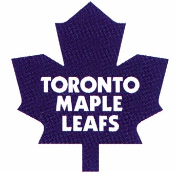
I'm very surprised to see a team go to a two color scheme, I didn't think that would ever happen. Obviously very similar to the Maple Leafs. It's a "classic" look, and very simple which I can't say I dislike. I'm still not sure about it though, it can also be viewed as a bit plain. I didn't mind the current jerseys, but anything is an improvement on the original TB logo, ugh.
Quite the change from the 90's though, when slanted lines and gross colors like teal, purple and green where all the rage!
What do you guys think?
|
|
|
semin-rules
PickupHockey Veteran


Canada
1915 Posts |
Posted - 02/15/2011 : 14:24:16
|
I really like them actually !
They look super different but in a good way. I like the away jerseys better the home though. I like how it says "Tampa" over top the
logo. It's a nice change and I see nothing wrong with at all ! |
 |
|
|
leigh
Moderator


Canada
1755 Posts |
Posted - 02/15/2011 : 14:36:23
|
| It looks like something out of a Marvel comic book. |
|
|
|
just1n
PickupHockey Pro
282 Posts |
Posted - 02/15/2011 : 15:07:34
|
Yeah, I thought that too. Trying to look classic but it ends up looking like it's out of a comic book a bit for sure.
I'm pretty tired of the circle logo they are using for the shoulder patch too. Florida, Nashville, Minnesota, St. Louis (did I miss any?) are all using that in some way, mostly for third jerseys.
Hard to draw the line between too far out there and boring though! Here's some of the uglier ones we've seen:
http://mattgunn.wordpress.com/2007/06/01/the-top-10-ugliest-nhl-jerseys/
|
|
|
|
leigh
Moderator
Canada
1755 Posts |
Posted - 02/15/2011 : 21:13:10
|
| Great link justin. The Canucks and Mighty Ducks ones are pretty bad, but the worst one is the LA Kings one is the absolute worst! |
|
|
|
polishexpress
PickupHockey Pro
525 Posts |
Posted - 02/15/2011 : 22:05:26
|
This is old news, the lighting officially unveiled this just over two weeks ago, on January 31, 2011.
Here are some more photos from the club site: http://lightning.nhl.com/club/gallery.htm?id=20070
Someone mentioned their similarity to the Leafs, and for me, they are too much like Toronto Maple Leafs colours. When they will play in their new jerseys, I'll have to check who is playing TO or TB! |
Edited by - polishexpress on 02/15/2011 22:17:27 |
|
|
|
Guest7694
( )
|
Posted - 02/15/2011 : 22:22:18
|
Timeless and simple. "Has a real original 6 feel to it", says some poster from the link provided. Well, that's probably because it IS an original 6 jersey -- just with the logo from a sunglasses company.
http://www.electricvisual.com/
Sorry, Maple Leafs, we just thought your jersey was so cool. Hope you don't mind if we use it! Thx!
It will look so silly when they play eachother.
Timeless and simple. Too bad every other team is trying to make their jerseys look like an original 6 team as well. Blues 3rd Jersey, Wild 3rd and Home Jerseys, Coyotes regular jerseys. New is cool. Vintage is cool but not quite as cool. Brand new but looks old is the Tits! I suppose pre-ripped jeans are going to come back into style too.
And about those 10 ugliest jerseys.
10. Those penguins jerseys are fine.
9. Those Thrashers jerseys are dope! They aren't trying be a classic team. Because they aren't.
8. Canucks flying V. Belongs there, but they have a place in my heart.
7.Indeed ugly.
6. Terrible logo, but more should be done by teams with a crest/logo there. A crest/logo there can make for a clean simple look that would definitely prove to be timeless.
5,4,3,2,1 All suck.
That is all. |
|
|
|
T-RAV
Top Prospect
Canada
75 Posts |
Posted - 02/16/2011 : 03:01:07
|
The new Tampa sweaters look simple. I don't dislike it. It certainly does look like the Leafs sweater tho. As for ugliest sweaters I go with Vancouver's "flying V" at #8 and the Kings third sweater at #6 is bloody atrocious. Yuck! But I actually like the Coyotes "robot coyote" at #5.
Peace and Respect |
|
|
|
OILINONTARIO
PickupHockey Pro

Canada
816 Posts |
Posted - 02/16/2011 : 15:34:38
|
Number 7 apparently matches up almost exactly to a diagram of a uterus! Nicknamed the "Mooterus" in Dallas at the time.
The Oil WILL make the playoffs in 2012. |
|
|
| |
Topic |
|