| Author |
 Topic Topic  |
|
jbraiter
PickupHockey Pro

577 Posts |
 Posted - 03/06/2007 : 13:59:54 Posted - 03/06/2007 : 13:59:54


|
[quote]Originally posted by semin-rules
[quote]Originally posted by I HATE CROSBY
AND I PROMISE THE LEAFS WILL GET MORE POINTS THAN PITTSBURGH!!!!!!!!!!!!!!!!!!!!!!!!!!!!!!!!!!!!!!!!!!!!!!!!!!!!!!!!!!!!!!!!
I HATE CROSBY
[/quote/]
I just want to say are you serious? Dont make a promise that is not going to happen
Go Canucks |
 |
|
|
Mikhailova
PickupHockey All-Star

USA
2918 Posts |
Posted - 03/06/2007 : 15:47:46
|
quote:
Originally posted by Guest9393
Blue Jackets dont refer to a bug....it has to do with the American Revolutionary War and Ohio's soldiers that served.
I knew it wasn't referring to a bug, but I didn't know the part about the Revolutionary War...interesting. But unless my history is off, only the 13 colonies fought and Ohio wasn't one of them....maybe you mean the Civil War. |
|
|
|
ryschevy1
Rookie


Canada
186 Posts |
Posted - 03/06/2007 : 15:54:20
|
YAAA!!! POST # 100!!!!!
I voted other for the Oilers third logo. Not exactly sure what it is bit it looks cool!
GO OIL!!! YA!!! |
|
|
|
Mikhailova
PickupHockey All-Star
USA
2918 Posts |
Posted - 03/06/2007 : 16:00:47
|
| Well there's the oil drop of course, and I think Beans said the five rivets (there are 4 other people in the NHL besides Craig with the last name Rivet? Hahaha) are supposed to represent the 5 Cups the Oilers have won. |
|
|
|
PainTrain
PickupHockey Veteran

Canada
1393 Posts |
Posted - 03/08/2007 : 17:21:52
|
I loved the old sabres jerseys with the swords crossing and the Buffalo in the middle its so cool.
GO Sabres GO!!!!!! |
|
|
|
Guest9666
( )
|
Posted - 05/01/2007 : 08:28:58
|
| Edmonton Oilers |
|
|
|
trev_linden
Top Prospect
2 Posts |
Posted - 05/02/2007 : 22:38:52
|
1994 canuck jerseys,
doesn't get any sweeter than that
[img]http://www.frameworth.com/cart/detailedImage/d_2988.jpg[/img] |
|
|
|
Saku Steen
PickupHockey Veteran
Canada
1102 Posts |
Posted - 05/03/2007 : 03:44:17
|
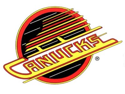
| I think those jersey are ugly. I almost like the V-neck ones better! Its just a circle with canucks through it. |
|
|
|
semin-rules
PickupHockey Veteran
Canada
1915 Posts |
Posted - 05/03/2007 : 05:29:22
|
[img]http://www.nbcsports.com/2006/1107/336854_240X320.jpg[/img]
There is no way that those are better than the '94 jerseys. Those jerseys were bad, but not even close to as bad as that!
~~~~~Great season Stars, better luck next year~~~~~ |
|
|
|
trev_linden
Top Prospect
2 Posts |
Posted - 05/04/2007 : 17:44:29
|
it's not a circle with canucks in it, it's a skate that says canucks along the blade, and the away jerseys *black* were frekin awsome,
and that logo is awsome beacause of the flying skate
|
|
|
|
Mikhailova
PickupHockey All-Star
USA
2918 Posts |
Posted - 05/04/2007 : 18:03:46
|
| Whoa...I never noticed it was a skate. That's cool. The Canucks have all these stories about their logos that not many people seem to know...the stick on the old blue and green ones is supposed to be a C, the "circle" is a skate with Cancuks written as the blade...cool. |
|
|
|
GOWINGS19
Rookie
USA
232 Posts |
Posted - 05/04/2007 : 21:53:10
|
the old school canucks is awesome but nowadays i really like the sabres and wild's logos
"I dont need to score the goal. I need someone to start thinking about me and forgetting about scoring goals." -Vladmir Konstantinov |
|
|
|
Saku Steen
PickupHockey Veteran
Canada
1102 Posts |
Posted - 05/05/2007 : 05:21:42
|
| I still dont see the skate... oh well |
|
|
|
Mikhailova
PickupHockey All-Star
USA
2918 Posts |
Posted - 05/05/2007 : 07:21:08
|
| Look at the red part at the top of the circle...it's supposed to look like a skate. |
|
|
|
Saku Steen
PickupHockey Veteran
Canada
1102 Posts |
Posted - 05/05/2007 : 16:01:47
|
quote:
Originally posted by Mikhailova
Look at the red part at the top of the circle...it's supposed to look like a skate.
Yesss, I see it! Thanks
|
|
|
|
fly4apuckguy
PickupHockey Pro
Canada
834 Posts |
Posted - 05/11/2007 : 14:13:30
|
I actually like the third jersey of the Washington Capitals. It just looks clean and sharp to me. The other Caps logo is nice, too. They have someone with a brain in their marketing dept.
Can't beat the classics, though - Chicago, Habs, Leafs, Bruins...
You miss 100% of the shots you don't take. - Gretz |
|
|
|
Mikhailova
PickupHockey All-Star
USA
2918 Posts |
Posted - 05/11/2007 : 15:23:11
|
| Actually the original six have the six most boring logos in the league. |
|
|
|
fly4apuckguy
PickupHockey Pro
Canada
834 Posts |
Posted - 05/11/2007 : 15:47:18
|
Ah, but the question is about the coolest, not the most exciting. Are the original 6 logos exciting? Not really. Are they cool? Yes, from my traditional standpoint.
You miss 100% of the shots you don't take. - Gretz |
|
|
|
I´m also Cånädiön
Rookie

Sweden
217 Posts |
Posted - 05/13/2007 : 12:03:01
|
Coolest: Wilds, Flyers, Red Wings.
Lamest: Penguins looks like a badly drawn cartoon, it´s like some other team would play with B1 or B2 on their jerseys. The old Penguin Logo wasn´t bad at all tough.
(Formerly known as Guest1603) |
|
|
|
Guest0942
( )
|
Posted - 05/13/2007 : 12:42:50
|
| i like the new buffalo one |
|
|
|
Guest4435
( )
|
Posted - 04/26/2009 : 16:11:29
|
| Canucks Vintage..!!!!! |
|
|
|
Antroman
PickupHockey Pro
Canada
537 Posts |
Posted - 04/26/2009 : 17:42:58
|
The Mighty Maples have the best logo of all sports teams in the world because it depicts the symbol of our nation and I am very proud to be a Canadian. Also, the Bluejays are now wearing a red leaf on their sleeve which makes me doubly proud. Just look around at some of those others: Buffalo - Slimey Snail
Oilers - Stupid Oil Rig
Detroit - Dead Bird Wing
Montreal - Toilet Seat
Ottawa - What The Freak Is That? Condom Advertisement?
Calgary - A Barrel Racing Horse
Pittsburg - A Drunken Penquin
Boston - A Bear Or A Steering Wheel? |
|
|
|
Guest9967
( )
|
Posted - 04/26/2009 : 18:04:59
|
| BLACKHAWKS without a DOUBT |
|
|
|
Sensfan101
PickupHockey Pro

Canada
500 Posts |
Posted - 04/27/2009 : 04:57:10
|
You definately need Chicago coolest logo ever
You miss 100 percent of the shots you don't take Wayne Gretzky |
|
|
|
Guest4453
( )
|
Posted - 04/27/2009 : 06:08:25
|
by far CHICAGO BLACKHAWKS
one of the coolest jerseys in all sports... |
|
|
|
Guest2171
( )
|
Posted - 04/27/2009 : 06:41:11
|
| The Jets logo. |
|
|
|
Guest0820
( )
|
Posted - 04/27/2009 : 06:56:54
|
quote:
Originally posted by Antroman
The Mighty Maples have the best logo of all sports teams in the world because it depicts the symbol of our nation and I am very proud to be a Canadian. Also, the Bluejays are now wearing a red leaf on their sleeve which makes me doubly proud. Just look around at some of those others: Buffalo - Slimey Snail
Oilers - Stupid Oil Rig
Detroit - Dead Bird Wing
Montreal - Toilet Seat
Ottawa - What The Freak Is That? Condom Advertisement?
Calgary - A Barrel Racing Horse
Pittsburg - A Drunken Penquin
Boston - A Bear Or A Steering Wheel?
right... good one for the center of the universe
take a look at your logo:
blue leaf... that's "real" canadian, isn't it?? (fools...)
also, the word "leafs" right on the center of the logo?? (fools again...)
no wonder toronto kids grow up half as intelligent as the rest of canada!!! |
|
|
|
Matt_Roberts85
PickupHockey Pro

Canada
936 Posts |
Posted - 04/27/2009 : 10:27:10
|
hah, Toronto has some of the smartest youth in the country living in it. Our universities and colleges are second to none in canada. Not to mention some of the best athletes come from here. How many NHLers come from Toronto or just outside Toronto? Tons.
hehe, anyways. The leafs vintage logo that they use for their 3rd jersey is the best. The blackhawks are racist lol.
The sharks have a cool logo as well.
There is no "I" in team, but there is an "M" and an "E". |
|
|
|
Matt_Roberts85
PickupHockey Pro
Canada
936 Posts |
Posted - 04/27/2009 : 10:55:35
|
by the way, Conne Smythe chose the maple leaf as his teams logo to salute the canadian infintry who wore a maple leaf on their shoulder. The canadian flag as we know it today, wasn't even invented yet. Thats how badass the maple leafs logo is. Our soldiers have killed germans while wearing it. Hell there were actual maple leafs (broda, smythe among others) who actually did the killing for us, than came home to win stanley cups for the maple leafs.
There is no "I" in team, but there is an "M" and an "E". |
|
|
|
Guest4948
( )
|
Posted - 04/27/2009 : 12:44:20
|
| Hartford Whalers! When i first saw the "H" in it (didn't notice it till years after it came out), thought it was brilliant! |
|
|
|
Guest3387
( )
|
Posted - 04/27/2009 : 12:50:02
|
| The Leafs. |
|
|
|
Topic |
|